)
What does it mean for a map to be high quality?
To me, it’s three things:
1. It must look great (display quality)
2. It must have great routing (data quality)
3. It must be searchable for what you want (geocoding quality)
OpenStreetMap is a fantastic display map already. If you look at it, you’ll know what I mean. The richness of the content shines through and you can see it’s a detailed and complete map.
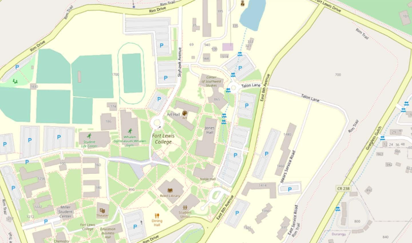
An OpenStreetMap view of beautiful Durango, Colorado, USA
For routing, it’s a little harder to discern. You can’t typically see the routing information just by looking at most maps, because things like turn restrictions and speed limits are not usually shown. How can we then surface where a map needs to be improved for routing?
Well, this is why we built MapMetrics. You can read more about it here in our previous blog post, but briefly, MapMetrics uses billions of GPS traces from people driving to tease out where there are map routing issues.
To do this, we take GPS traces and try to route against them. Where the route closely matches GPS traces on average, we suppose the map data is pretty good. Where the traces diverge from what a routing engine thinks a driver should do, the map quality will tend to be lower.
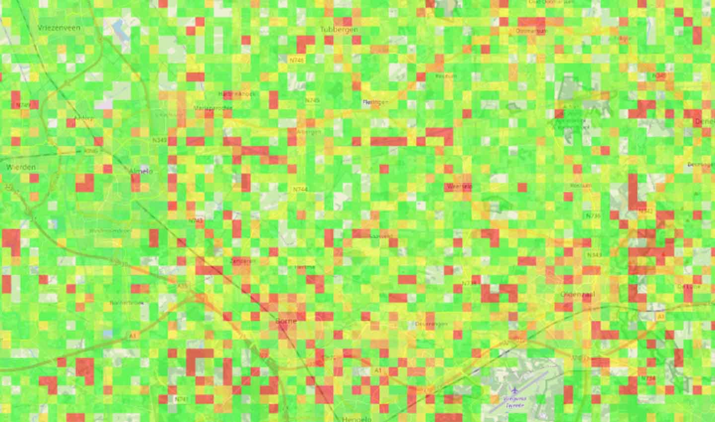
MapMetrics displays areas of good (green) and not-so-good (red) routing quality in OSM
For example, imagine you drive somewhere. If your phone tells you to turn left and you do, it’s safe to assume that the route is probably good. But if you instead turn right, then there’s a good chance the map is wrong somehow. If everyone turns right, that chance instead becomes near certain. This is what MapMetrics measures: how closely people follow the route their navigation systems would give them.
Since we introduced MapMetrics we’ve made some improvements we’d like to share with you.
Removing Bad Data
Our biggest challenge with MapMetrics is that it relies on the GPS data to be accurate. While we have plenty of vehicles in our GPS data, we also have people riding trains and skiing at ski resorts. We’ve been working on ways of removing this data. In the case of airports, ski resorts, ports, and other edge cases we’re simply removing the affected tiles, filtering out the clearly defined areas that don’t contain roads.
For trains, it’s more complicated:
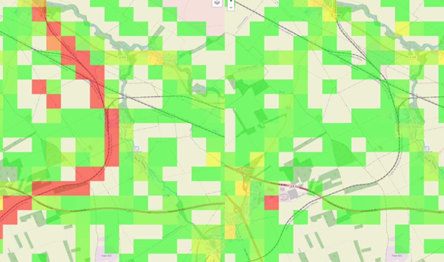
A MapMetrics tile in France showing the location of a trainline in July 2021 (left) and after it has been removed in August (right)
If you look at the image above, on the left you can see a good example: a trainline showing up in red as the MapMetrics system tries to take GPS traces from people on trains and route a car against it. This of course doesn’t work and shows up as red tiles.
On the right of the same image, you can see the result of removing the train GPS traces. We built a train routing engine to test traces. If a trace routes well against train tracks, then it’s probably a train, and so we remove it.
Due to removing trains and filtering out places like airports the quality of MapMetrics data is now substantially better and there are far fewer errant red tiles. You can see this in MapMetrics from the August dataset and later months, and this should save everyone time looking for places to fix in OSM.
Downloadable Data
All the tile data is now available for download, from the “Download Dataset” button at the top of the MapMetricsWorld website. This is organized per-month in a zip file and contains CSV data with all the metrics we have. This data can be used to prioritize edits or analyze quality on a large scale.
API
We’ve shipped an API for getting the data behind the MapMetrics visualizations. You can read the technical documentation here. You can now access the tile-level data on-demand as well as what countries and datasets are available through the API. The API can be used by map editors like iD and JOSM to highlight areas to edit for end users.
Fin
We hope you find all these updates useful in our joint quest for higher map quality with OSM. Feedback is most welcome, please email us here.
People also read
)
Happy birthday, OpenStreetMap!
)
Keeping maps fresh: The life of a TomTom mapping car driver
)
How to gain back time: The mystery of travel time accuracy debunked
* Required field. By submitting your contact details to TomTom, you agree that we can contact you about marketing offers, newsletters, or to invite you to webinars and events. We could further personalize the content that you receive via cookies. You can unsubscribe at any time by the link included in our emails. Review our privacy policy. You can also browse our newsletter archive here.